Simple Scanner HUD
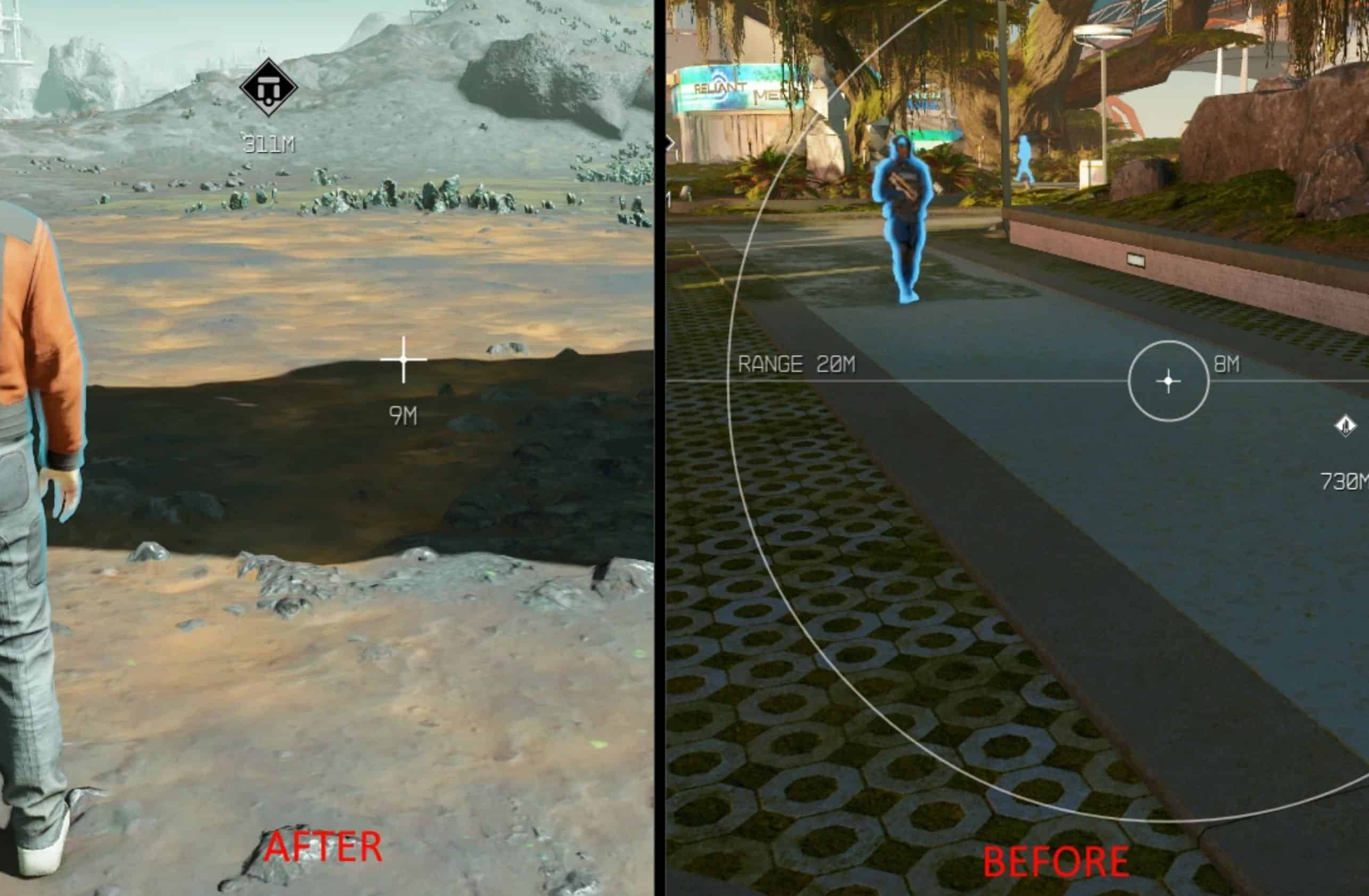
Changes the scanner to a more simplified look, without all the screen clutter.
Features:
– Removed vignette & circles (glitched circles are still present)
– Removed max scan text
– Added larger + crosshair instead of circle crosshair
– Moved distance text under the crosshair (before it was to the right)
– 3 versions. 30/60/120 FPS.
– Redesigned the planet info HUD to be more condensed and simple (with smaller trait icons). It’s now at the top right where it doesn’t clutter the bottom middle of the screen.
– Completed Biomes now have a yellow icon instead of the “Biome Completed” – to further clean up the HUD.
TODO List:
Various QoL things
Different colors
Installation:
1. Copy the “Data” folder to your Starfield main directory (where Starfield.exe is located) and override any files.
2. There should be monoclemenu.swf in “Data/Interface”

